
Colors
Control colors across your entire website from a single place by using Sana’s global color palette.
Quick links
Color palette
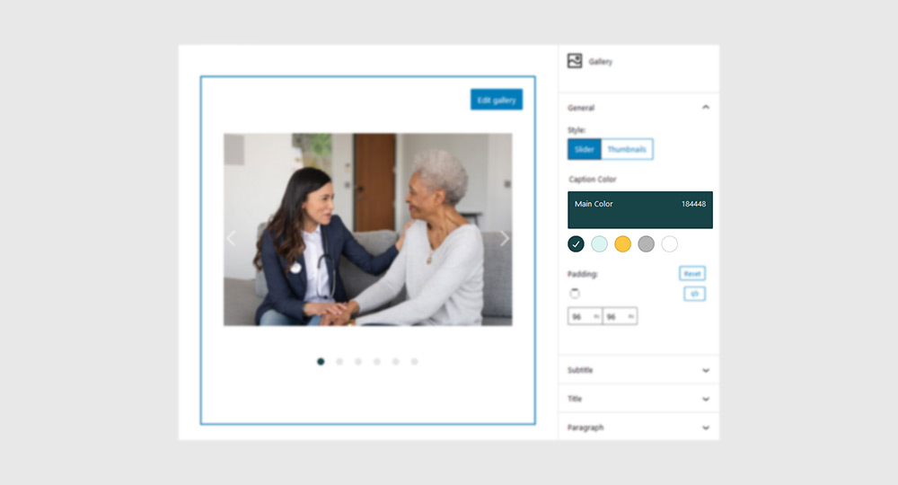
Navigate to Sana Panel → Settings → Branding to view and edit your site’s color palette. These colors are deeply integrated into the core element of your theme and they are also the default color palette for Sana Blocks (in the Gutenberg editor).
Note: Changing the global colors will affect your entire website.
Tip: If you plan to use a dark color scheme (like Dark mode) for you website, you can achieve this by doing the following:
- Inverse the colors in your color palette (make the ‘Main Color’ light and the ‘Negative Color’ dark).
- Swap your logos (upload the light version of your logo in the ‘Dark Logo’ section and the dark version in the ‘Light Logo’ section).
- If your header transparency style is set to ‘Auto Detect’, change it to ‘Auto Detect (reverse)’
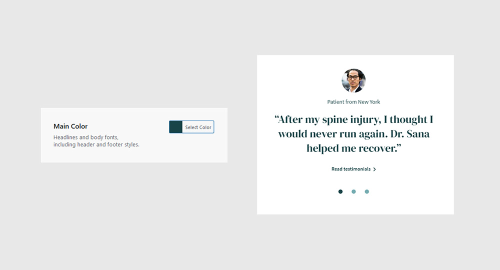
Main Color
The default color of many elements across the site such as: Headlines, body text, header and footer styles, links etc.
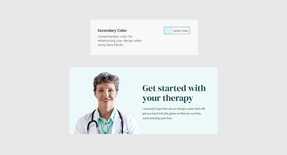
Secondary Color
Complimentary color for enhancing your design when using Sana blocks.
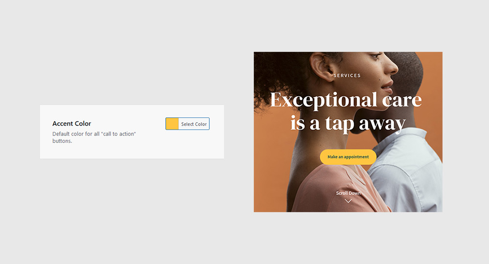
Accent Color
Default color for all “Call to action” buttons and a useful tool for making an element stand out visually.
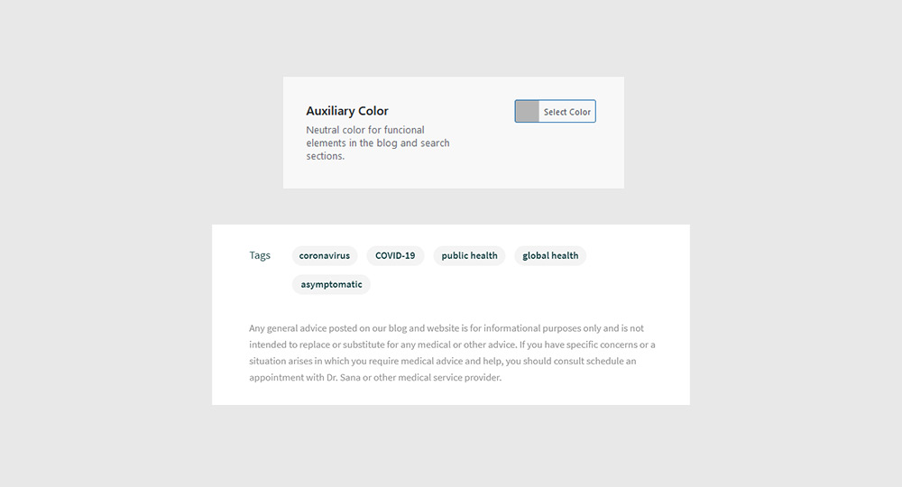
Auxiliary Color
A neutral color for functional elements (separator lines, icons, labels etc.) in the blog and search sections.
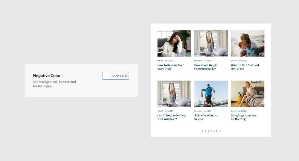
Negative Color
A color that is in contrast with the “Main Color” and is usually used as a background in blocks, buttons, headers and footers.
Using colors
Once you have defined your color palette in the settings panel, it will appear in the Gutenberg editor wherever there is a color picker, regardless of whether you are using Sana Blocks or the native Gutenberg blocks.