
Popup Card
Whether you’re looking to share updates, gather feedback, or lead your visitors down a certain path, there’s a popup waiting to lend a hand.
Quick links
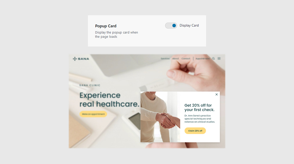
Enabling Popup
Navigate to Sana Panel → Settings → Notifications and turn on the “Display Card” toggle to make the Popup Card visible on your website. The card appears in the bottom right corner.
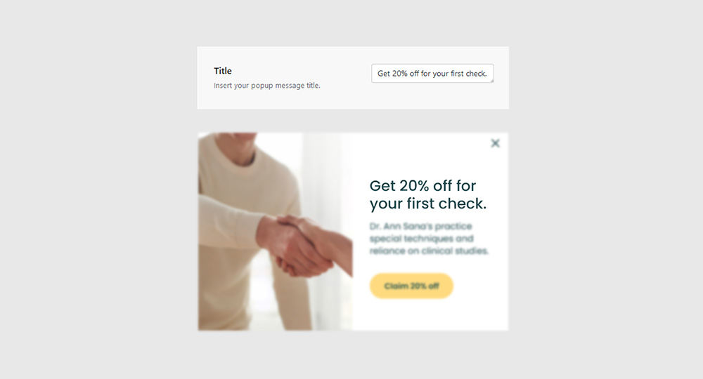
Title
Insert the Popup Card title (or other HTML content) in the available field.
Note: Supported HTML tags: p, a, b, i, h1, h2, h3, h4, h5, h6, br, em, strong, img
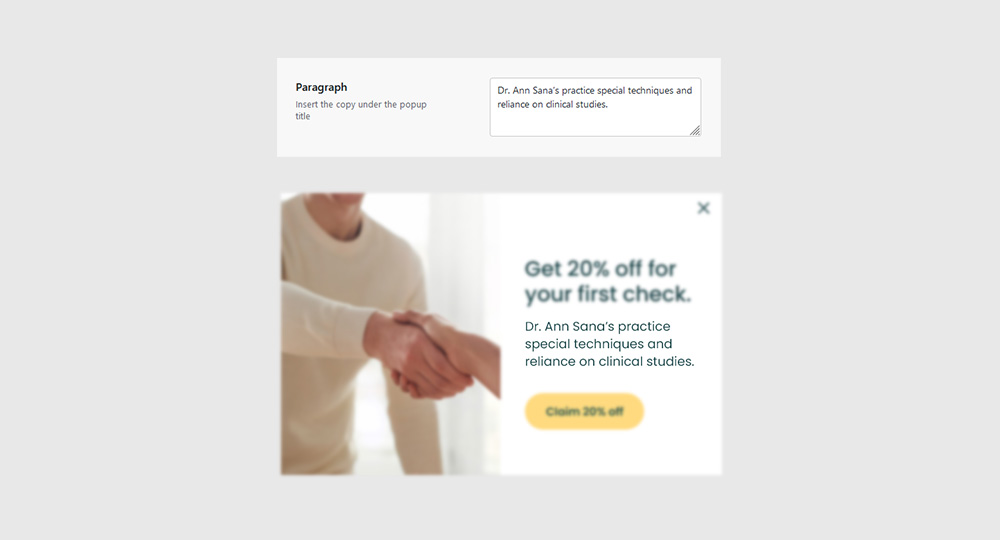
Paragraph
Insert the Popup Card title (or other HTML content) in the available field.
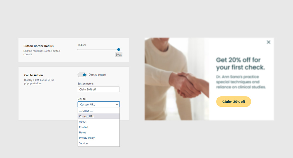
Call to Action
Display the Call To Action button by turning on the “Display Button” toggle. Fill in the “Button Name” field and and choose a link source. You can link one of your existing pages or you can insert a Custom URL.
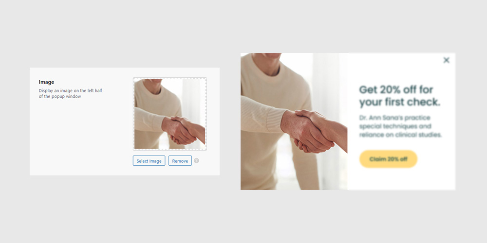
Image
Display an image on the left half of the popup window by clicking the Select logo button and choosing an image from your computer or media library.
Note: We recommend using a .jpg image that is at least 400 pixels tall.
Note: If no image is selected, the right half of the popup window will not be visible.
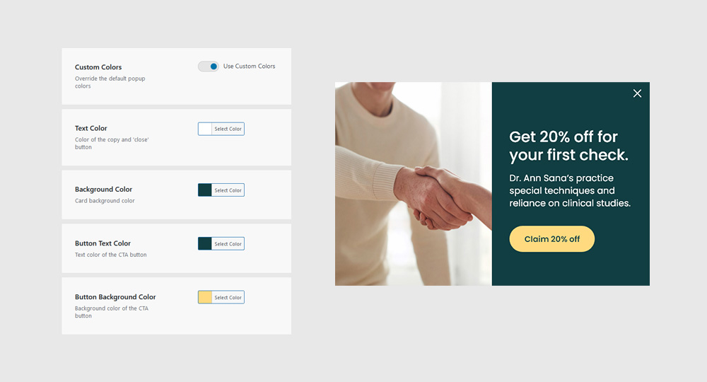
Custom colors
Change the appearance of your Popup Card by turning on the “Use Custom Colors” toggle and by editing existing color values.