
Header
Make the header look and behave just like you want it to.
Quick links
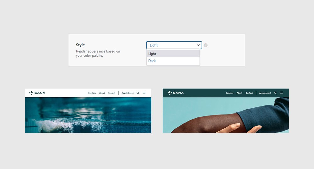
Style
Navigate to Sana Panel → Settings → Header and in the ‘Style’ card select one of two options from the drop down menu.
- Light style uses ‘negative’ color for the background and ‘primary’ color for the links
- Dark style uses ‘primary’ color for the background and ‘negative’ color for the links
Note: The chosen header style will also load the respective logo style. If there is only one logo style uploaded, then that logo will be displayed regardless of the style selected.
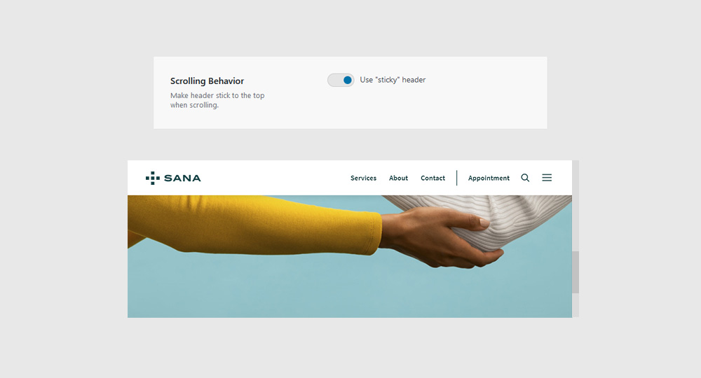
Scrolling Behavior
Turn on the Use ‘Sticky’ Header toggle to make header stick to the top of the page when scrolling. This option has universal effect on all screen sizes.
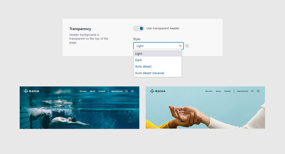
Transparency
Turn on the Use Transparent Header toggle to make the header background transparent when the page is scrolled to the top.
Select one of four transparency styles from the drop down menu:
- Light – Uses your ‘negative’ color for the links and the light version of your logo
- Dark – Uses your ‘primary’ color for the links and the dark version of your logo
- Auto Detect – Picks the right style based on the calculated background brightness
- Auto Detect (Reverse) – If your color palette is composed mainly of dark tones, consider using this option
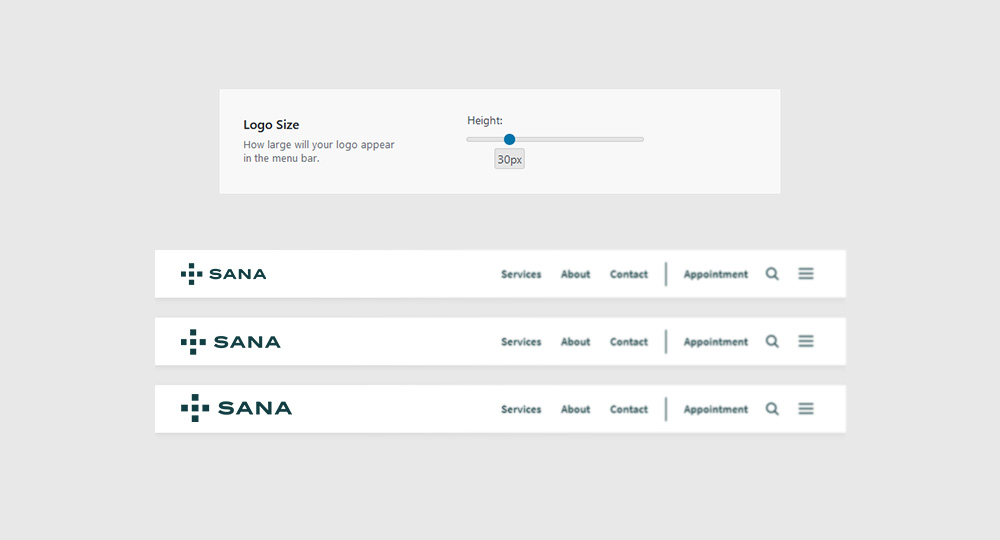
Logo Size
Choose how large will your logo appear in the header by moving the slider left or right.
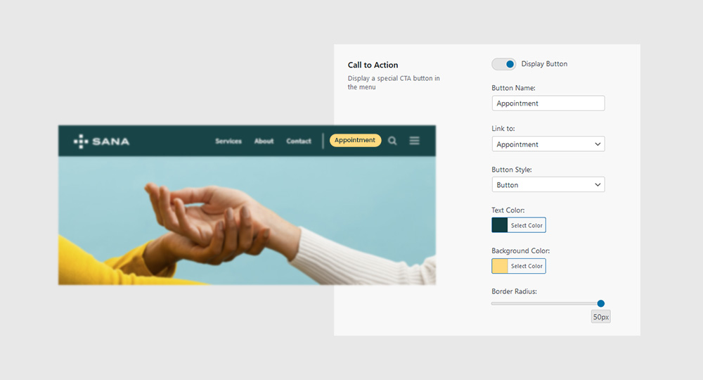
Call to Action
Display a global ‘CTA’ button in the header area. Customize the look and behavior of the button by changing its label, link address and style.
Note: The ‘Call to Action button’ is part of the ‘Header Menu’ and is not visible on mobile screens by default. To display it in the mobile menu, add the desired link to the ‘Side Menu’ location.
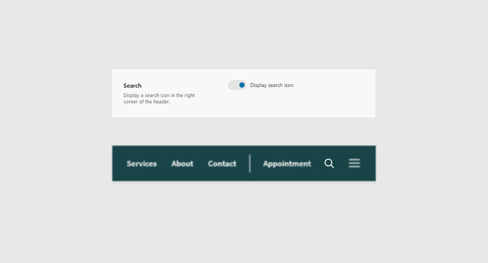
Search
Display a search icon in the right corner of the header area. The icon is visible on both mobile and desktop views and it opens up a search field when clicked/tapped.