50/50 Block
Animate a rotational card movement based on the position of your mouse as it hovers over an element.
Quick links
Overview
A section is a layout element with a width of 100% that extends across the full width of the browser window. Sections play an important role in the structure and layout of a page. Sections let you create separate blocks of content and divide the page into meaningful segments.
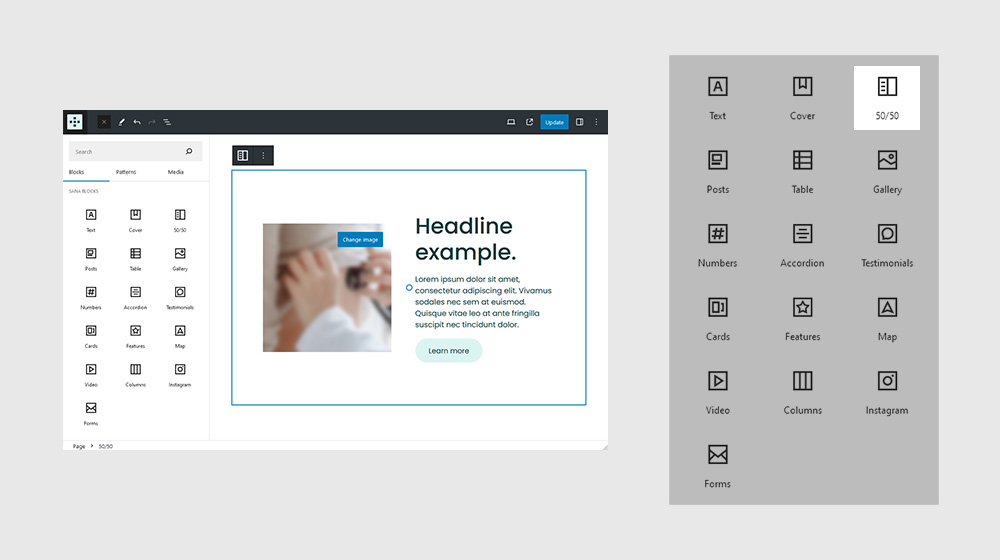
Settings
It’s not very practical, though, if you’re looking to create a blog, or a design portfolio. Same thing with restaurant menus, news sites, or any other type of site with content that’s constantly changing.
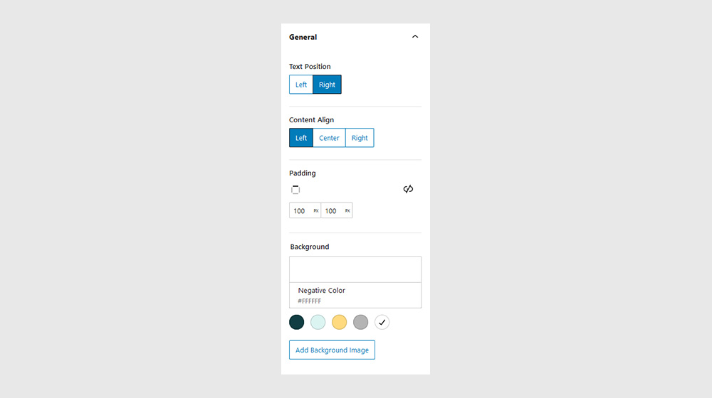
General
In some cases, like when creating hero sections, you may give a Section a specific height. In this case, use the viewport height (vh) unit to specify the Section height.
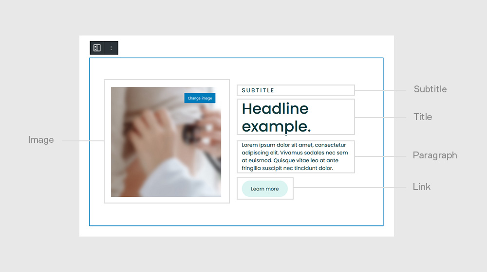
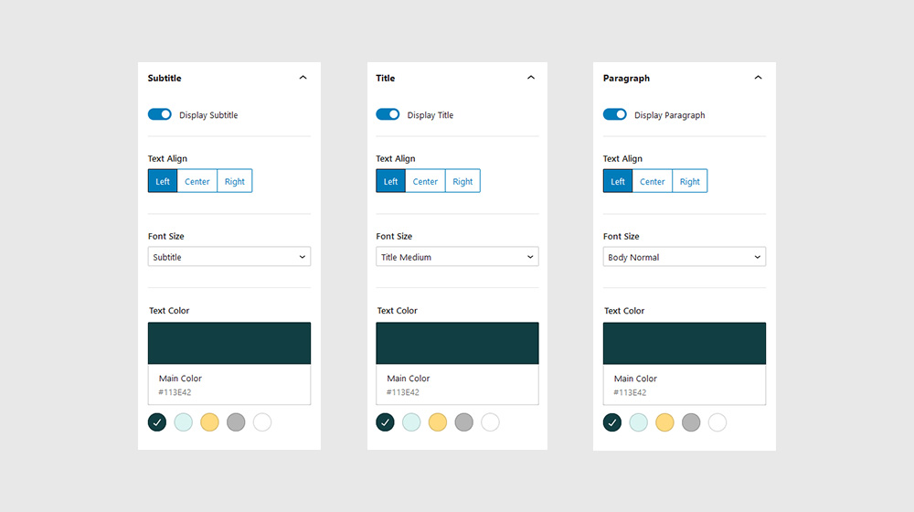
Subtitle, Title, Paragraph
In some cases, like when creating hero sections, you may give a Section a specific height. In this case, use the viewport height (vh) unit to specify the Section height.
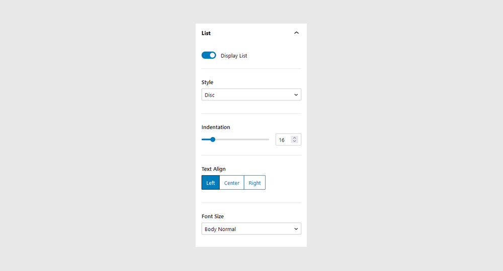
List
In some cases, like when creating hero sections, you may give a Section a specific height. In this case, use the viewport height (vh) unit to specify the Section height.
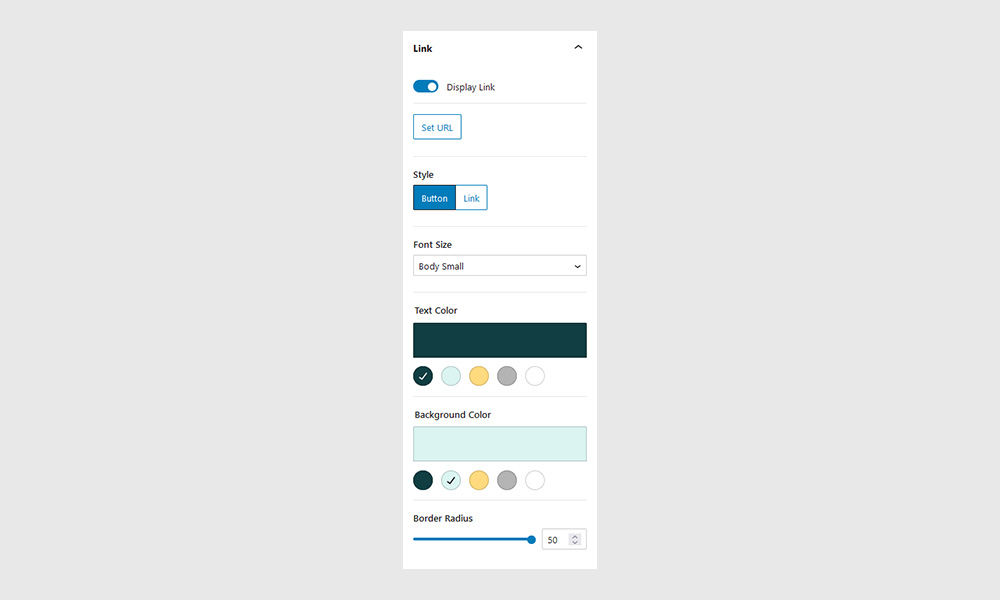
Link
In some cases, like when creating hero sections, you may give a Section a specific height. In this case, use the viewport height (vh) unit to specify the Section height.
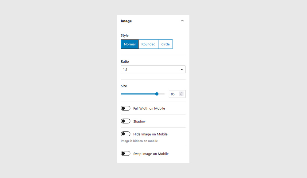
Image
In some cases, like when creating hero sections, you may give a Section a specific height. In this case, use the viewport height (vh) unit to specify the Section height.
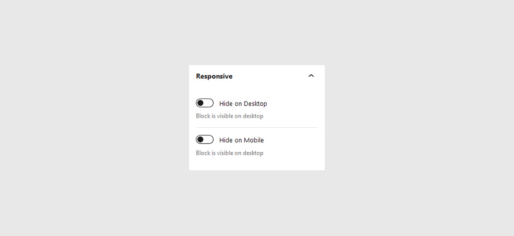
Responsive
In some cases, like when creating hero sections, you may give a Section a specific height. In this case, use the viewport height (vh) unit to specify the Section height.
