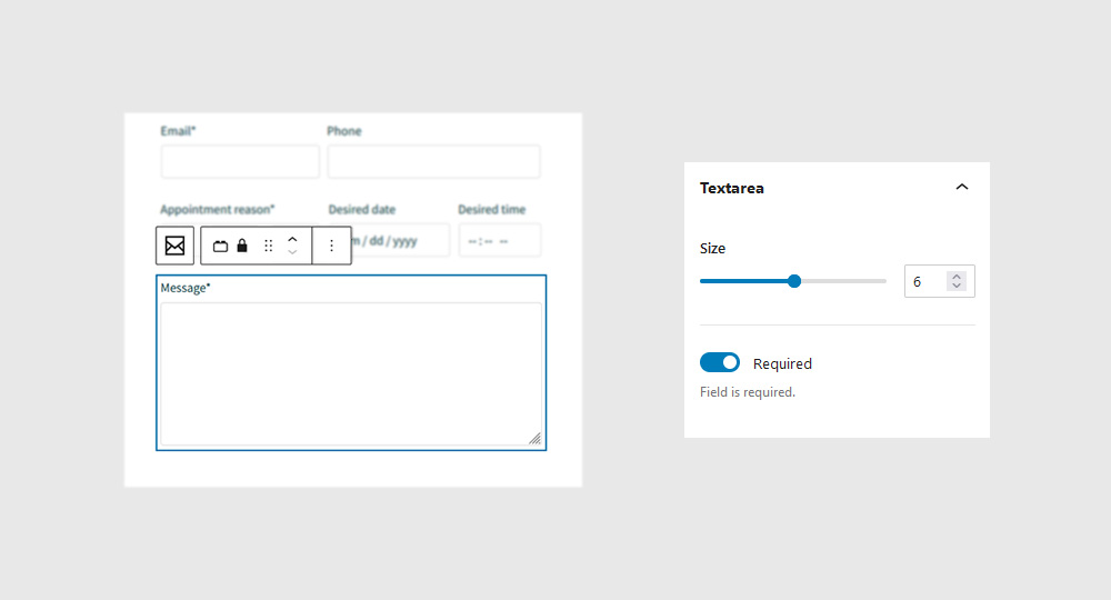
Forms Block
Animate a rotational card movement based on the position of your mouse as it hovers over an element.
Quick links
Overview
It’s not very practical, though, if you’re looking to create a blog, or a design portfolio. Same thing with restaurant menus, news sites, or any other type of site with content that’s constantly changing.
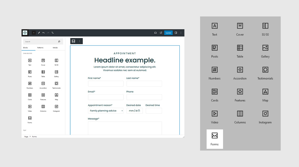
Settings
It’s not very practical, though, if you’re looking to create a blog, or a design portfolio. Same thing with restaurant menus, news sites, or any other type of site with content that’s constantly changing.
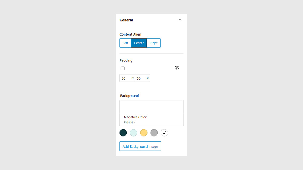
General
It’s not very practical, though, if you’re looking to create a blog, or a design portfolio. Same thing with restaurant menus, news sites, or any other type of site with content that’s constantly changing.
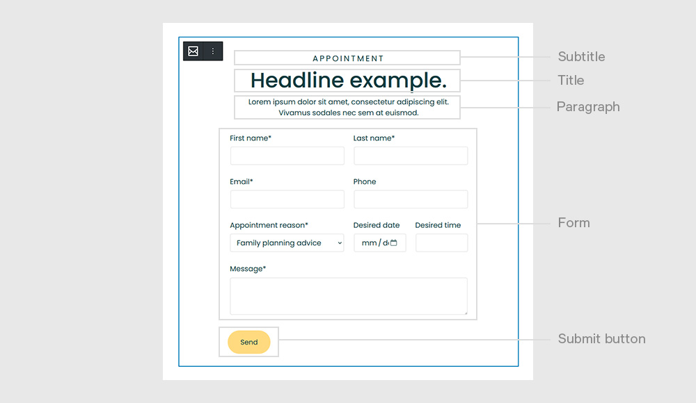
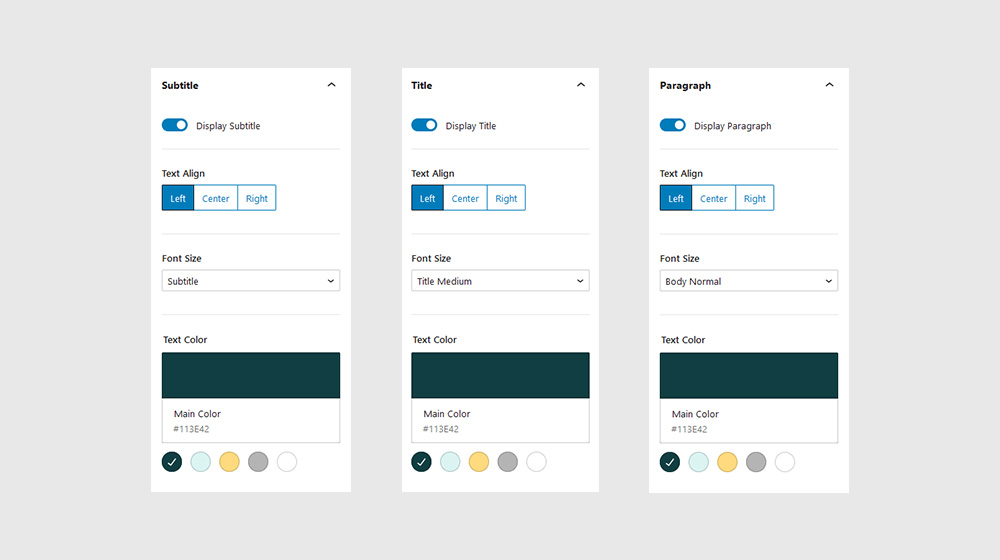
Subtitle, Title, Paragraph
It’s not very practical, though, if you’re looking to create a blog, or a design portfolio. Same thing with restaurant menus, news sites, or any other type of site with content that’s constantly changing.
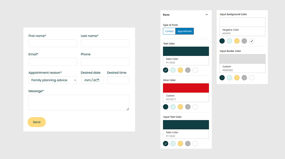
Form
It’s not very practical, though, if you’re looking to create a blog, or a design portfolio. Same thing with restaurant menus, news sites, or any other type of site with content that’s constantly changing.
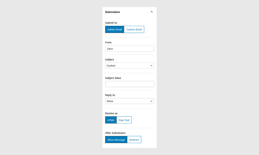
Submission
It’s not very practical, though, if you’re looking to create a blog, or a design portfolio. Same thing with restaurant menus, news sites, or any other type of site with content that’s constantly changing.
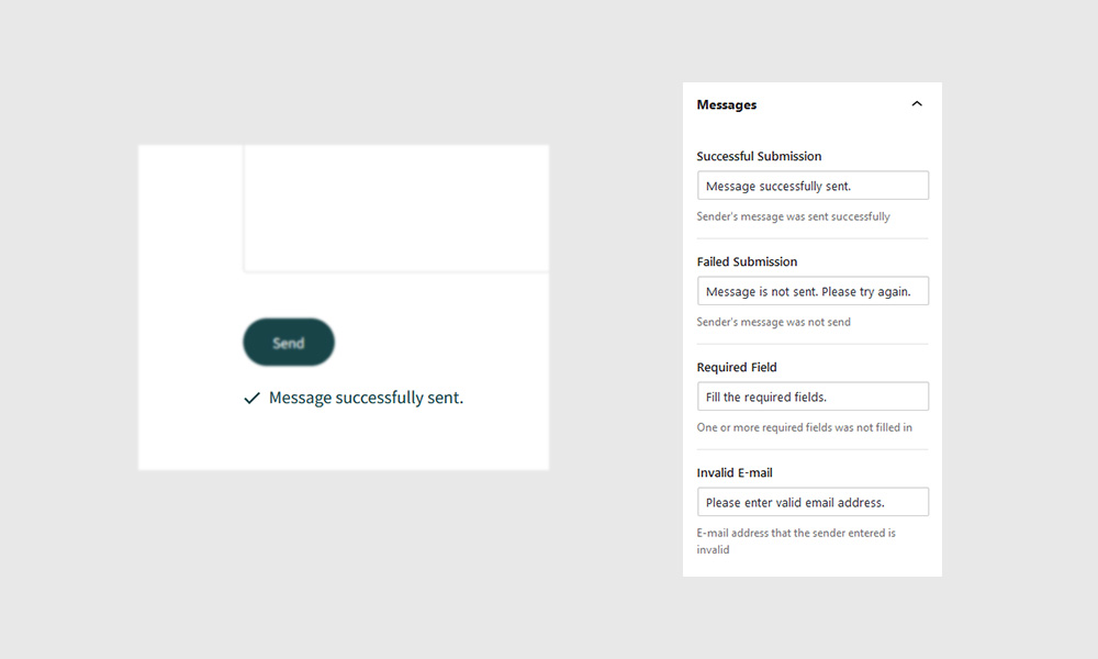
Messages
It’s not very practical, though, if you’re looking to create a blog, or a design portfolio. Same thing with restaurant menus, news sites, or any other type of site with content that’s constantly changing.
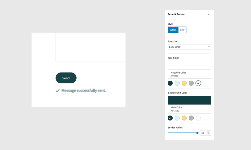
Submit Button
It’s not very practical, though, if you’re looking to create a blog, or a design portfolio. Same thing with restaurant menus, news sites, or any other type of site with content that’s constantly changing.
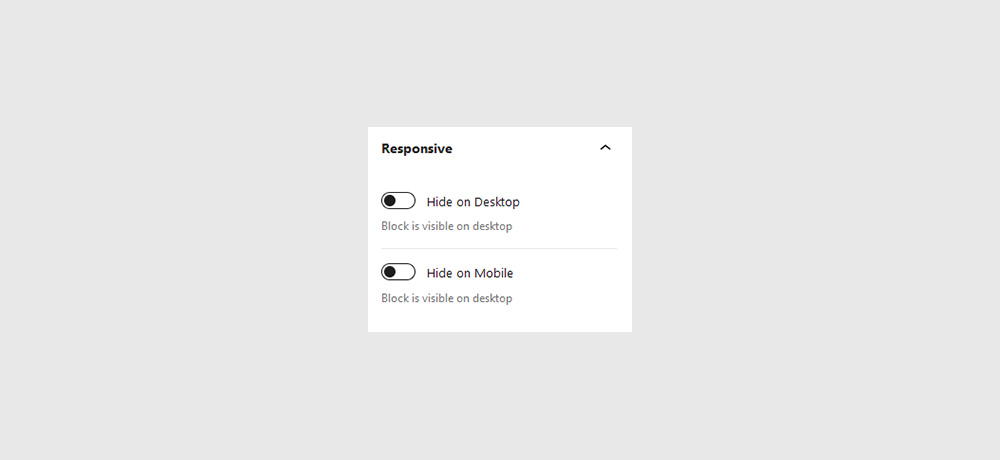
Responsive
It’s not very practical, though, if you’re looking to create a blog, or a design portfolio. Same thing with restaurant menus, news sites, or any other type of site with content that’s constantly changing.
Form fields
It’s not very practical, though, if you’re looking to create a blog, or a design portfolio. Same thing with restaurant menus, news sites, or any other type of site with content that’s constantly changing.
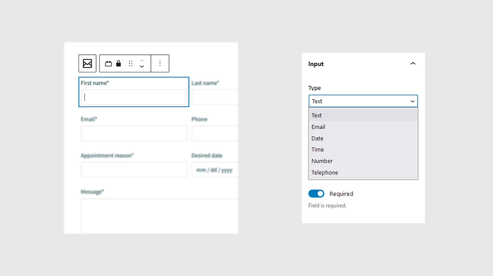
Input
It’s not very practical, though, if you’re looking to create a blog, or a design portfolio. Same thing with restaurant menus, news sites, or any other type of site with content that’s constantly changing.
Textarea
It’s not very practical, though, if you’re looking to create a blog, or a design portfolio. Same thing with restaurant menus, news sites, or any other type of site with content that’s constantly changing.
