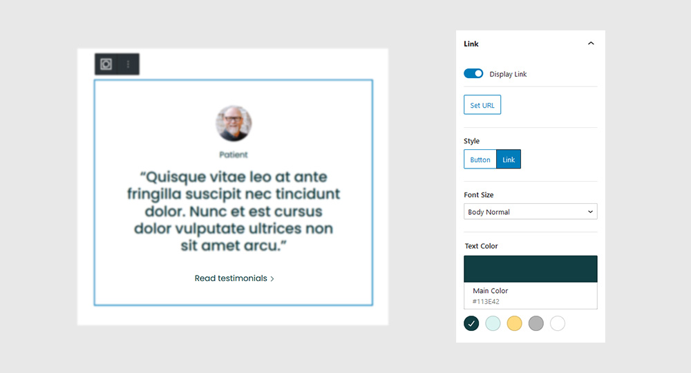
Testimonials Block
Animate a rotational card movement based on the position of your mouse as it hovers over an element.
Quick links
Overview
It’s not very practical, though, if you’re looking to create a blog, or a design portfolio. Same thing with restaurant menus, news sites, or any other type of site with content that’s constantly changing.
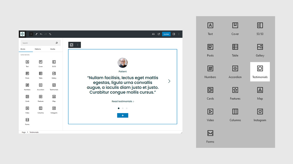
Settings
In some cases, like when creating hero sections, you may give a Section a specific height. In this case, use the viewport height (vh) unit to specify the Section height.
General
It’s not very practical, though, if you’re looking to create a blog, or a design portfolio. Same thing with restaurant menus, news sites, or any other type of site with content that’s constantly changing.
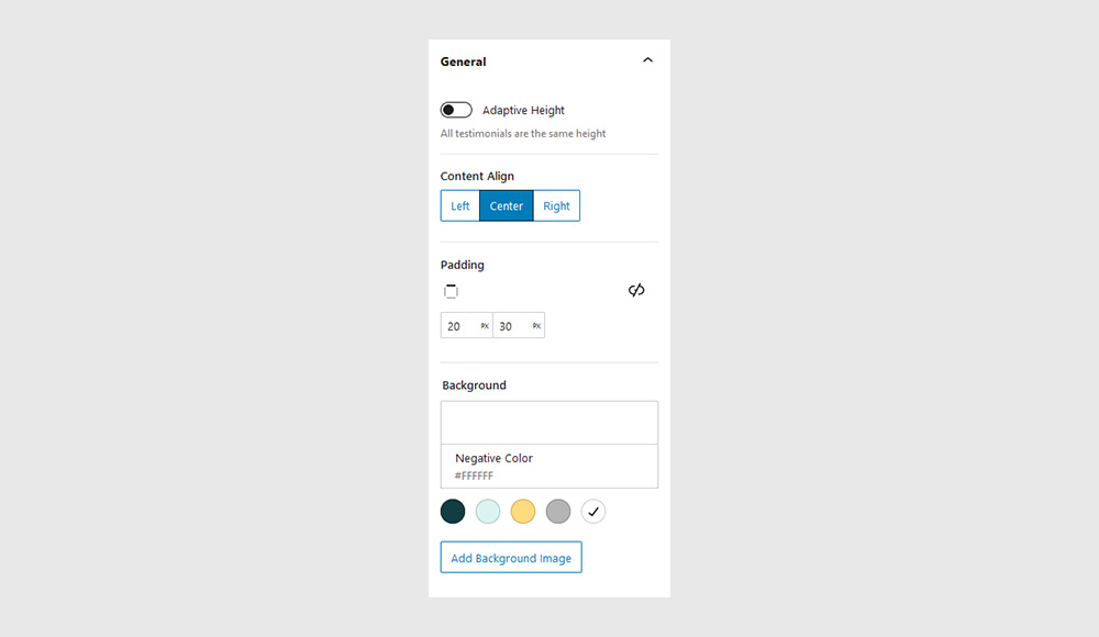
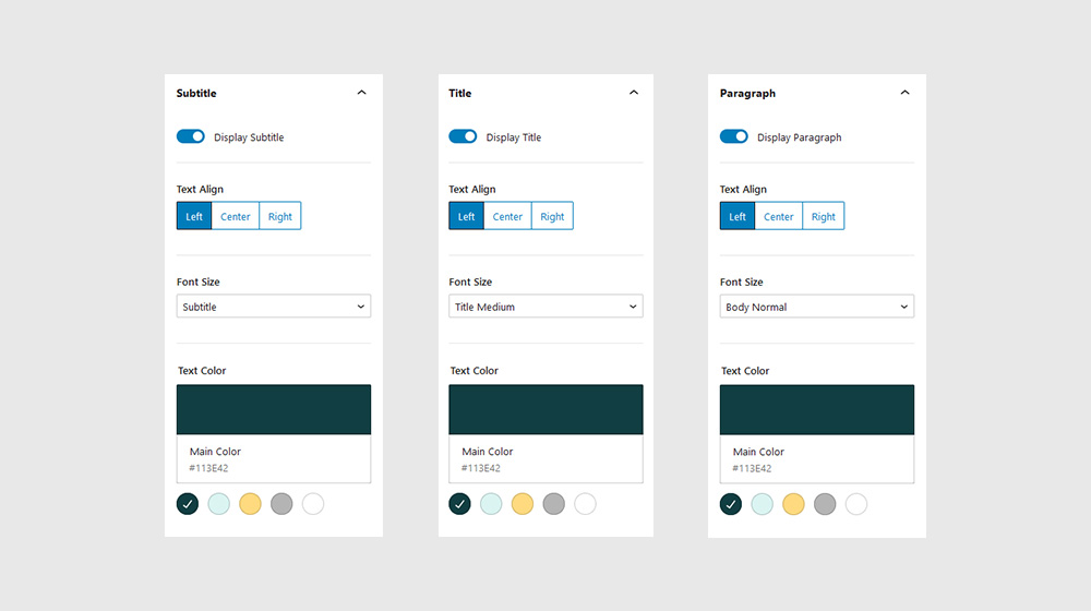
Subtitle, Title, Paragraph
It’s not very practical, though, if you’re looking to create a blog, or a design portfolio. Same thing with restaurant menus, news sites, or any other type of site with content that’s constantly changing.
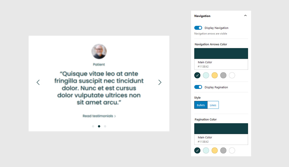
Navigation
It’s not very practical, though, if you’re looking to create a blog, or a design portfolio. Same thing with restaurant menus, news sites, or any other type of site with content that’s constantly changing.
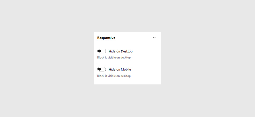
Responsive
It’s not very practical, though, if you’re looking to create a blog, or a design portfolio. Same thing with restaurant menus, news sites, or any other type of site with content that’s constantly changing.
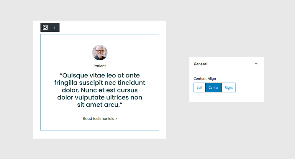
Testimonial Item
In some cases, like when creating hero sections, you may give a Section a specific height. In this case, use the viewport height (vh) unit to specify the Section height.
General
It’s not very practical, though, if you’re looking to create a blog, or a design portfolio. Same thing with restaurant menus, news sites, or any other type of site with content that’s constantly changing.
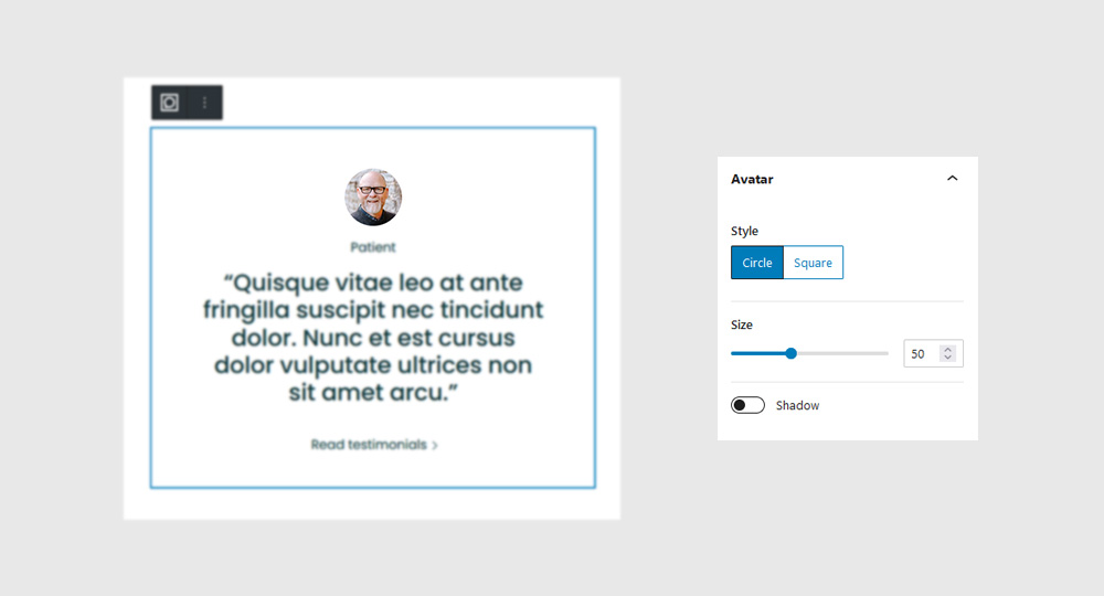
Avatar
It’s not very practical, though, if you’re looking to create a blog, or a design portfolio. Same thing with restaurant menus, news sites, or any other type of site with content that’s constantly changing.
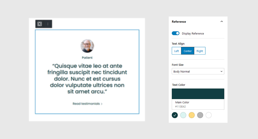
Reference
It’s not very practical, though, if you’re looking to create a blog, or a design portfolio. Same thing with restaurant menus, news sites, or any other type of site with content that’s constantly changing.
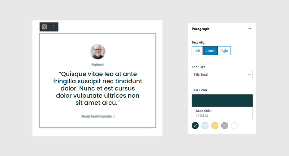
Paragraph
It’s not very practical, though, if you’re looking to create a blog, or a design portfolio. Same thing with restaurant menus, news sites, or any other type of site with content that’s constantly changing.
Link
It’s not very practical, though, if you’re looking to create a blog, or a design portfolio. Same thing with restaurant menus, news sites, or any other type of site with content that’s constantly changing.
