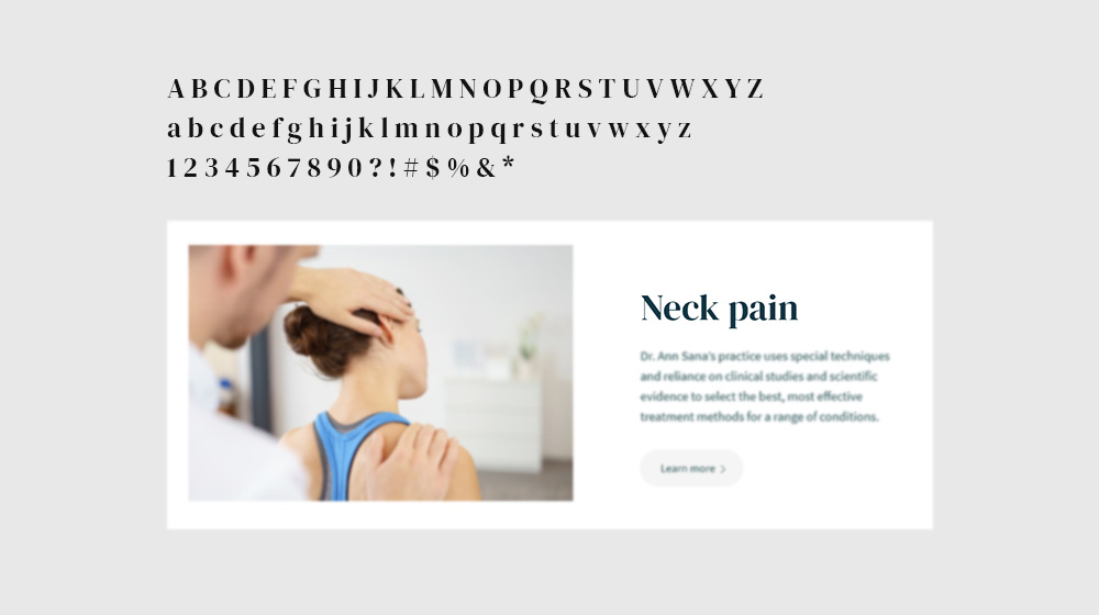
Choosing Fonts
Enjoy the rich typography options that Sana provides and take full control over fonts from the Google Library.
Quick links
Font Configuration
Sana is connected to the Google Fonts library which contains over 1500 font families. Navigate to Sana Panel → Settings → Typography to choose and configure the right fonts for you.
Tip: If you wish to use a specific font for your project that is not available in the Google Fonts library, we recommend using a third party plugin like Use Any Font.
Font Family
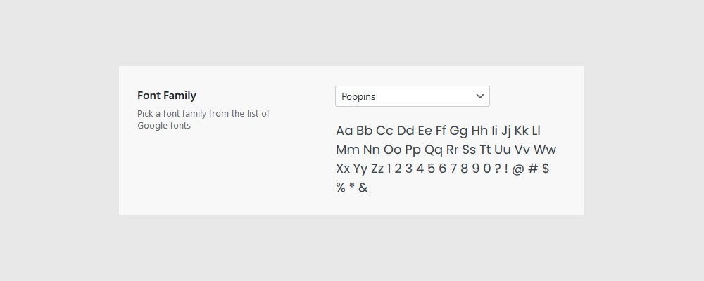
Pick a font family from the list of Google Fonts for both ‘Headlines’ and ‘Main Font’. You can see previews of the selected font family under the drop-down menu, or you can give it a test run on the Google Fonts site.
Tip: To create visual contrast between titles and paragraphs, choose either two quite different-looking font families (Serif/Sans Serif) or a single family with available weight and style variations (bold, regular, condensed etc.). To learn more about choosing type click here.
Font Weight
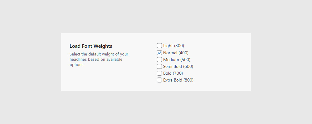
Select the font weights you plan to use for your ‘Headlines’ and ‘Main Font’. Bear in mind that each selected font weight impacts your site’s performance, so choose only the ones you need.
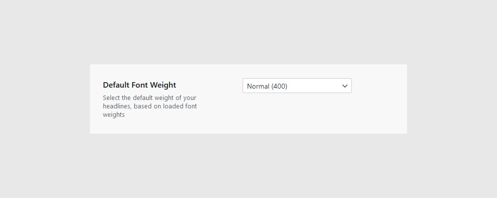
Once you have selected the desired font weights, choose a default weight from the drop-down menu, for both ‘Headlines’ and the ‘Main font’. This will be their default appearance whenever and wherever you use them on the website.
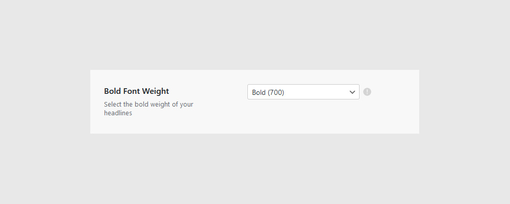
We recommend also choosing the default bold font weight, for instances where a text has been formatted to appear Bold (either by having a HTML tag or having been selected in the Gutenberg editor).
True Italics
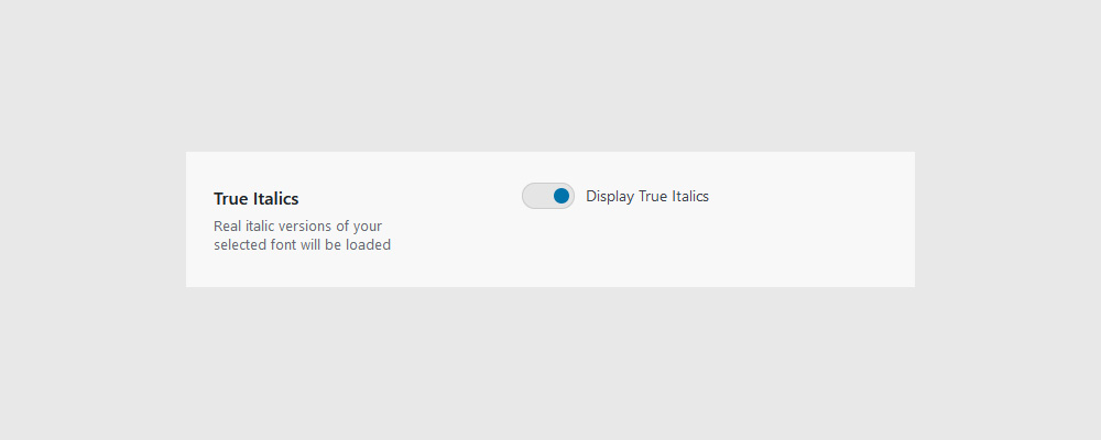
If the font family you chose has italic versions of the weights you have loaded, then by turning on this option, ‘real’ italic versions (instead of the browser-generated oblique/slanted versions) of your font will also be loaded.
Note: This option impacts your site’s performance as it downloads additional font styles for each selected font weight. We recommend turning it on only if you need to display your font in a ‘real’ italic style and also if you don’t have many font weights selected.
Main Font
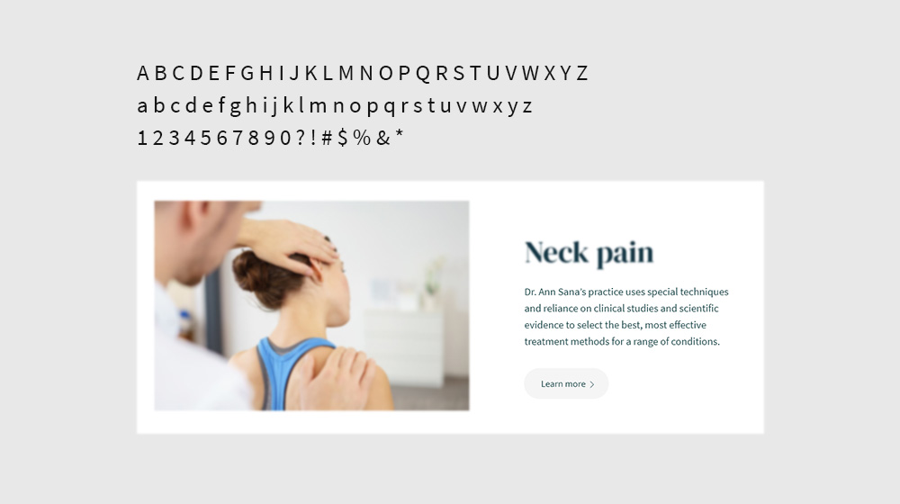
When choosing fonts, you should begin with your body text. This is going to be your main ‘workhorse’ font that will make up the majority of the copy on your website, so you want to pick this first and then choose a headline font to match.
You want to choose a clean serif or sans serif font that’s easy to read in long paragraphs and also works well with your brand (are you friendly or formal, casual or corporate).
Wen you install Sana and load one of the demos, we have configured the fonts for that particular design. That being said, if you decide to choose a different font, you might need to tweak it a bit as there is no universal typography settings. In general set your line height between 1.5. and 1.25 and use normal, book, or medium weights (400, 500).
Headline Font
Unlike body copy, you can use display fonts for headings. These generally have more detail and aren’t as legible at smaller sizes. When using a larger font size, you should also tweak the letter spacing and the line height. Much of this will be done by eye as you’re designing, but a good rule is to use a line height around 1-1.25 and a letter spacing of -1 to 1.
If you want your headlines to blend with your paragraphs so they look like they go together, you should also use a lower font weight or a lighter color so that your headlines don’t completely overwhelm your body copy.
For added variation in headlines, you can also use all caps as long as it’s not for long lines of text. Usually this is used for menu links, sub-headings, and labels.
